PediaRecs
Designing a solution for caregivers to make informed over-the-counter medication decisions for children.

Project Type
University of Toronto Faculty of Pharmacy Business Plan Competition Entry
The Team
Samra Ghazi
Jessica Lee
Theodora Udounwa
(Pharmacists)
My Role
User Research
UX/UI Design
Wireframing
Brand Design
Clinical Advisor
Tools
Figma
FigJam
Miro
Overview
How can we simplify making over-the-counter medication choices for caregivers?
Many caregivers face uncertainty when it comes to choosing the right over-the-counter medications for their children's health needs. With countless options available and varying symptoms to consider, the decision-making process can be overwhelming.
As a pharmacist, I know first-hand long wait times are a barrier to accessing care when you need it.
Here is the full problem I uncovered through user research, and the way I solved it.
The Problem
Choosing the right over-the-counter product for a child can be overwhelming due to the lack of accessible, reliable, and personalized guidance, which can sometimes lead to misuse.
How might we empower caregivers to make quick and informed decisions for their child's over-the-counter needs?
The Solution
My goal is to simplify this process by creating an intuitive and informative mobile application that provides tailored recommendations, addressing the unique needs of each child and giving caregivers the confidence they need to navigate their child’s health with ease.
Background
Before diving into the issue, I researched the problem space a bit more.
Contextual background
Choosing the right over-the-counter (OTC) medication for children is often challenging due to limited accessible, reliable, and personalized guidance, leading to potential misuse.
Supporting evidence:
A study (2009–2016) reported 4,756 significant adverse events (AEs) related to OTC cough and cold medications (CCMs):
Implication
This data underscores the critical need for a solution that empowers caregivers with quick, reliable, and personalized guidance to make informed decisions about over-the-counter medications for children.
User research: Sending out questionnaires to parents and caregivers in our community.
513 cases (10.8%)
Were attributed to medication errors.
235 cases (45.8%)
Of the errors involved children aged 2 to 6 yrs
231 cases (45.0%)
Were administered by parents
143 cases (28.8%)
Were administered by alternative caregivers
68.4%
Seek healthcare advice from pharmacists
76.4%
Of those who would ask a pharmacist found long wait times to be a barrier
Competitive analysis
I took some time to research competitors that have attempted to solve this problem, while focusing on pediatric care.

My main finding was that none of the tools on the market provides user-friendly experience for caregivers to select over-the-counter medications for children based on the Canadian guidelines.
I saw an opportunity to develop a platform where users can access healthcare advice quickly and reliably.
Findings & Analysis
Overall, there is a need for pediatric OTC guidance.
Affinity map
I spoke with caregivers in my community to understand what they truly thought about making OTC decisions when it comes to their children.
With each major insight on a sticky note, I grouped the insights by similarity and topic. The following themes emerged:

Affinity map
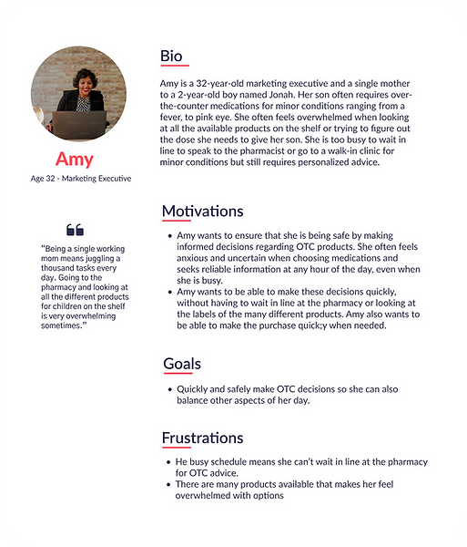
I summarized the most common motivations, goals, and frustrations into a single persona.
_edited.png)
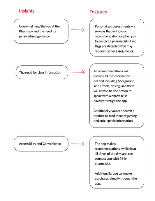
Feature roadmap
From the three major frustrations that were expressed, I outlined the main features that this app could have.
_edited.png)
Ideation & Design
Time for the challenge - making an app that caregivers can rely on.
Site map
After understanding the problem and the features needed to address these challenges, I started piecing together the information architecture.
I wanted to keep the app simple and user-friendly by making the questionnaires available on the home page while having another tab for product search.

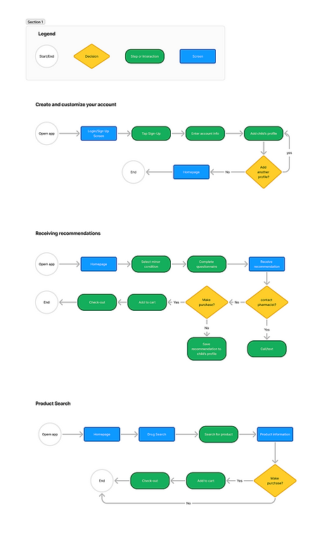
User flows
Once I was happy with the content organization, I began thinking about how I wanted the user to interact with the app to accomplish some important goals – create an account, get a personalized recommendation, and search through over-the-counter products.
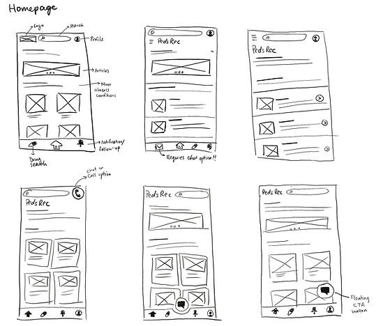
Low-fidelity explorations
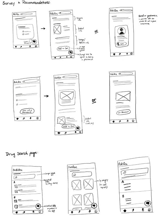
Here are some selected sketches that illustrate potential designs for the home screen and the questionnaire flow, leading to a recommendation.
_edited.jpg)
_edited.jpg)
Mid-fidelity wireframes
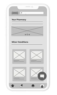
After brainstorming layouts, I selected my favourites and created a cleaner set of screens. These are a few of the key screens:
_edited.png)
Homepage
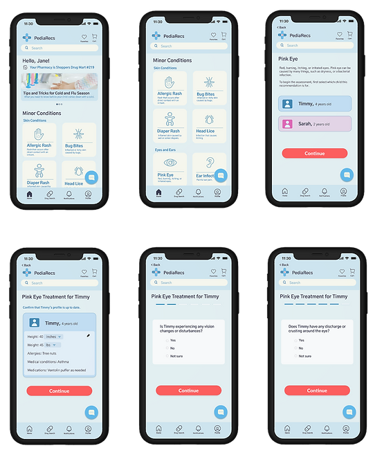
Users will have the minor conditions listed on the homepage for them to select, making receiving recommendations faster and easier.
Questionnaires
After users select a condition category, they will be prompted to select from their saved child profiles if applicable, then asked to confirm the child’s medical information, and finally will be shown a simple screen of multiple choice questions that will lead them to either a recommendation or a further assessment by a pharmacist.

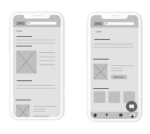
Results from questionnaire
_edited.png)
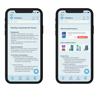
Option 1: Receiving an OTC product recommendation
If no red flags are reported, a recommendation will be given including information regarding the diagnosis, dosing, and any side effects.
_edited.png)
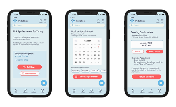
Option 2:Assessment required by a pharmacist.
If there are red flags, then the user will be directed to contact a pharmacist to access more information.
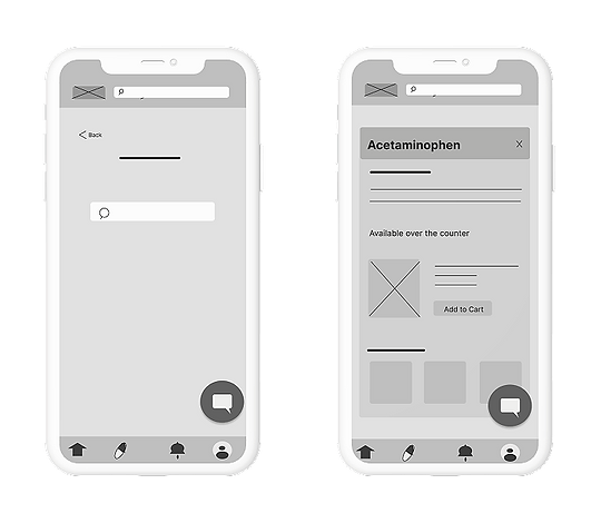
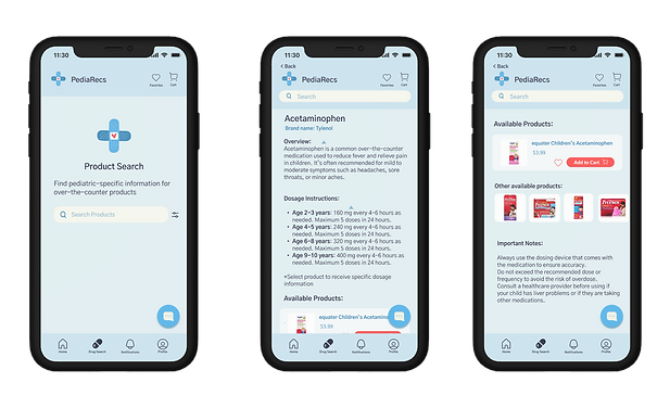
Product search
Be able to search for the products information, including side effects and dosages.
Usability Test
I tested two users' ability to complete these task flows in the mid-fidelity prototype.
I observed as two users completed tasks in the mid-fidelity prototype, analyzing their ease of navigation, and any pain points that arose.
Overall, both participants were able to complete the tasks with ease without error or hesitation.
However, one person brought up the issue of not having the option to book an appointment through the app instead of a call. With this feedback brought to my attention, I was able to include a “Book an Appointment” feature to the recommendation page.
Branding
Designing a trust-worthy brand.
In designing PediaRecs, my primary goal was to create an app that caregivers could trust. The branding needed to clearly communicate that PediaRecs is a reliable source of pediatric-focused information tailored to minor conditions.
For the logo, I chose a band-aid because it symbolizes simple, comforting care for children. It reassures users that the app is dedicated to addressing children's health concerns with the same attentiveness and reliability a band-aid represents. This results in a clean and trustworthy style guide.

High-Fidelity Prototype
Bringing it all together to create a high-fidelity prototype.
Based on the user research, and the low-fidelity and mid-fidelity explorations, I went ahead and designed a high-fidelity prototype.
Create an account

Filling out the questionnaire
Receiving a recommendation
Contact the pharmacist/book an appointment
Product search
Next Steps
Conclusion and future directions for PediaRecs
My team and I presented PediaRecs at the University of Toronto Faculty of Pharmacy Business Plan Competition 2022. The event featured new pharmaceutical business ideas from a variety of students, and was attended by a mix of students, university professors, and industry professionals.
My next step is to conduct more rounds of usability testing to see if this iteration resonates with the users.
_edited.png)
_edited.png)
_ed.png)
